Project Background
How can we design a website that is
“worth More” while defining a new, bespoke client recruitment journey
Strategic Design | UX/UI Design | Web Design
Fordel
Date
2025
My Role
Customer Experience, Workshop Planning & Facilitation, User Research, Wireframing, Prototyping, UI Design, Web Design, Developer Communication
Fordel is a bespoke wealth management firm committed
to helping their clients secure and grow their wealth through personalised advice and strategic planning. With decades of expertise and a strong reputation in the industry, Fordel approached us to redesign their website and ensure it reflected their values of trust, clarity, and long-term partnership.
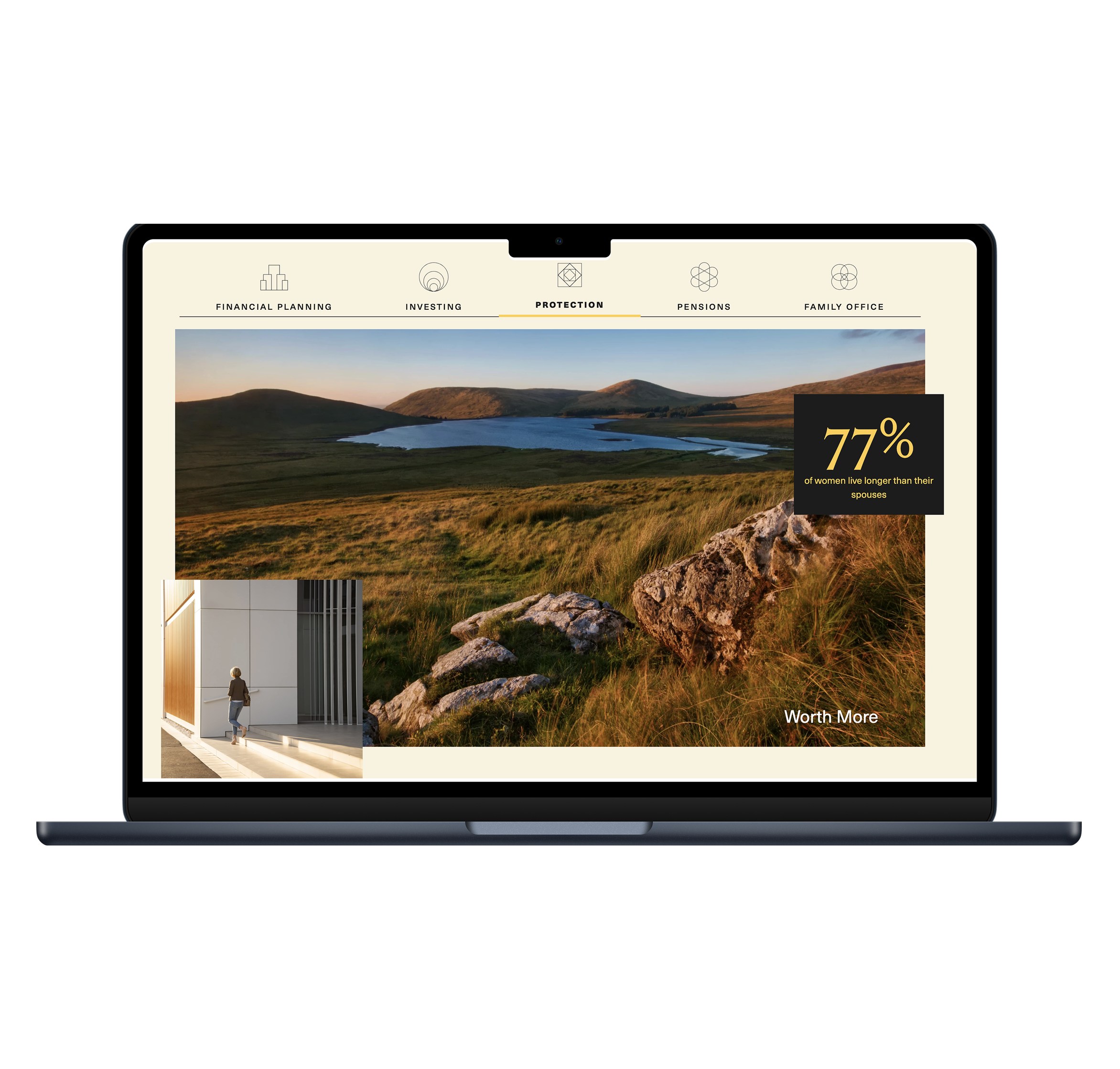
Their website, fordel.ie, serves as a primary touchpoint for new and existing clients providing insights into their services, approach, and commitment to guiding clients toward a richer financial future.
Launch a refreshed website that
communicates Fordel’s brand,
values, and professional identity.Support client engagement and growth by clearly outlining
service offerings and making
them more accessible.Build trust with a modern,
user-friendly digital experience that reflects Fordel’s
long-standing expertise.
Project Goal
User Research
We began by conducting stakeholder interviews to uncover internal priorities, business goals, and perceptions of user needs. These conversations helped align the team on what success would look like and where the current site was falling short.
Based on the interviews and some secondary research, proto personas were made to represent the users and clients Fordel was targeting.
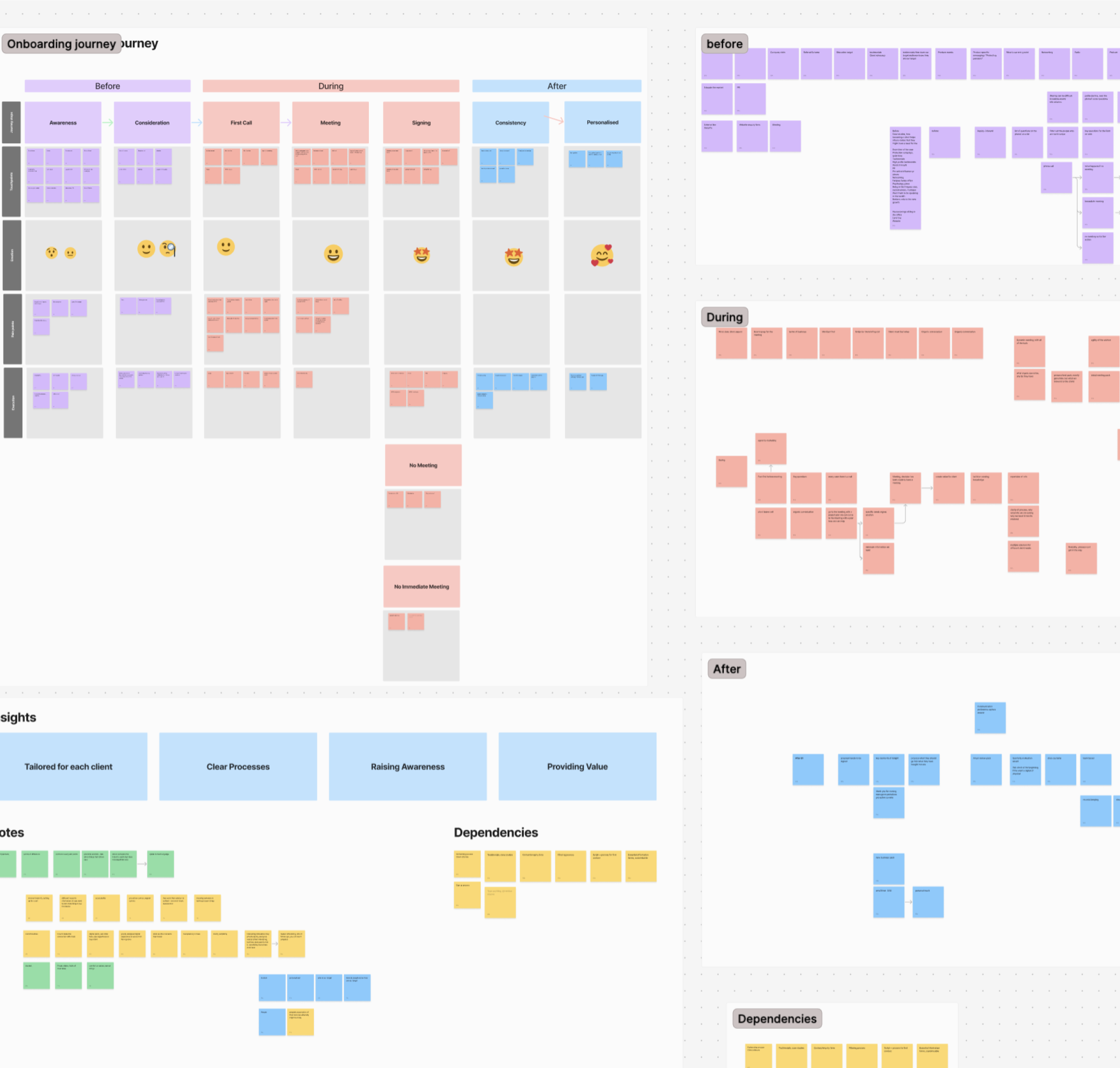
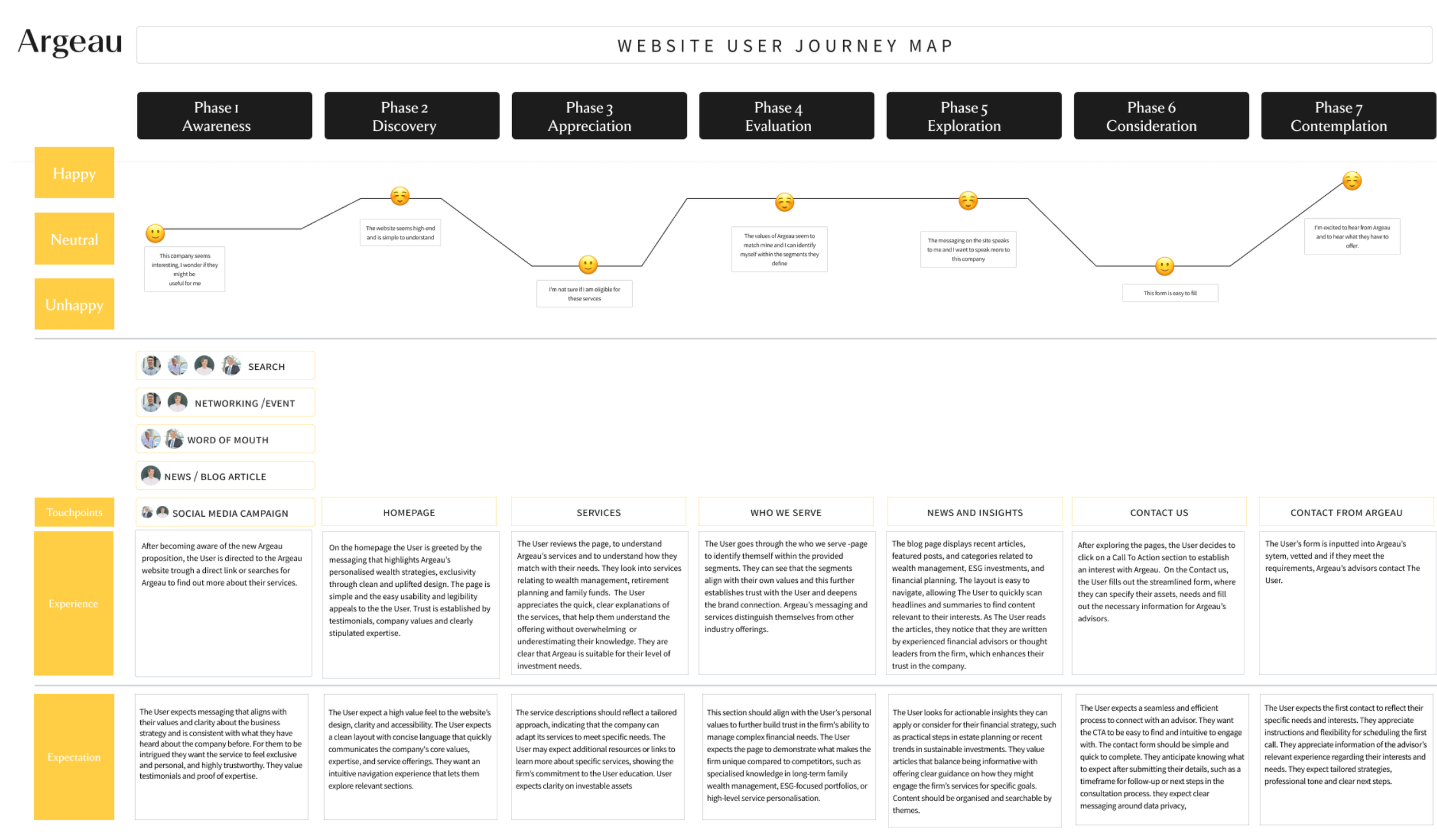
We planned and facilitated a customer experience workshop to map out the typical client journey, highlight key pain points, and identify opportunities for a more streamlined,
client-centred experience.
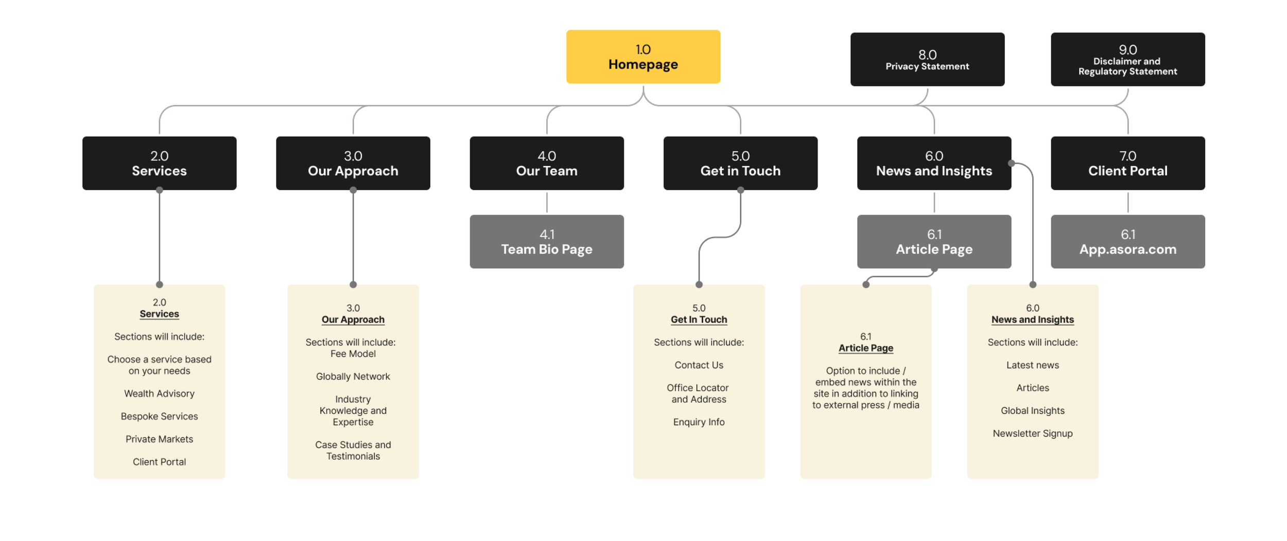
With limited time and budget, we were intentional about how insights were translated into design decisions. Findings from the workshop directly informed the new sitemap and content information architecture, helping
us prioritise what mattered most to users and to the business. Every step of the research was designed to be lean but effective.
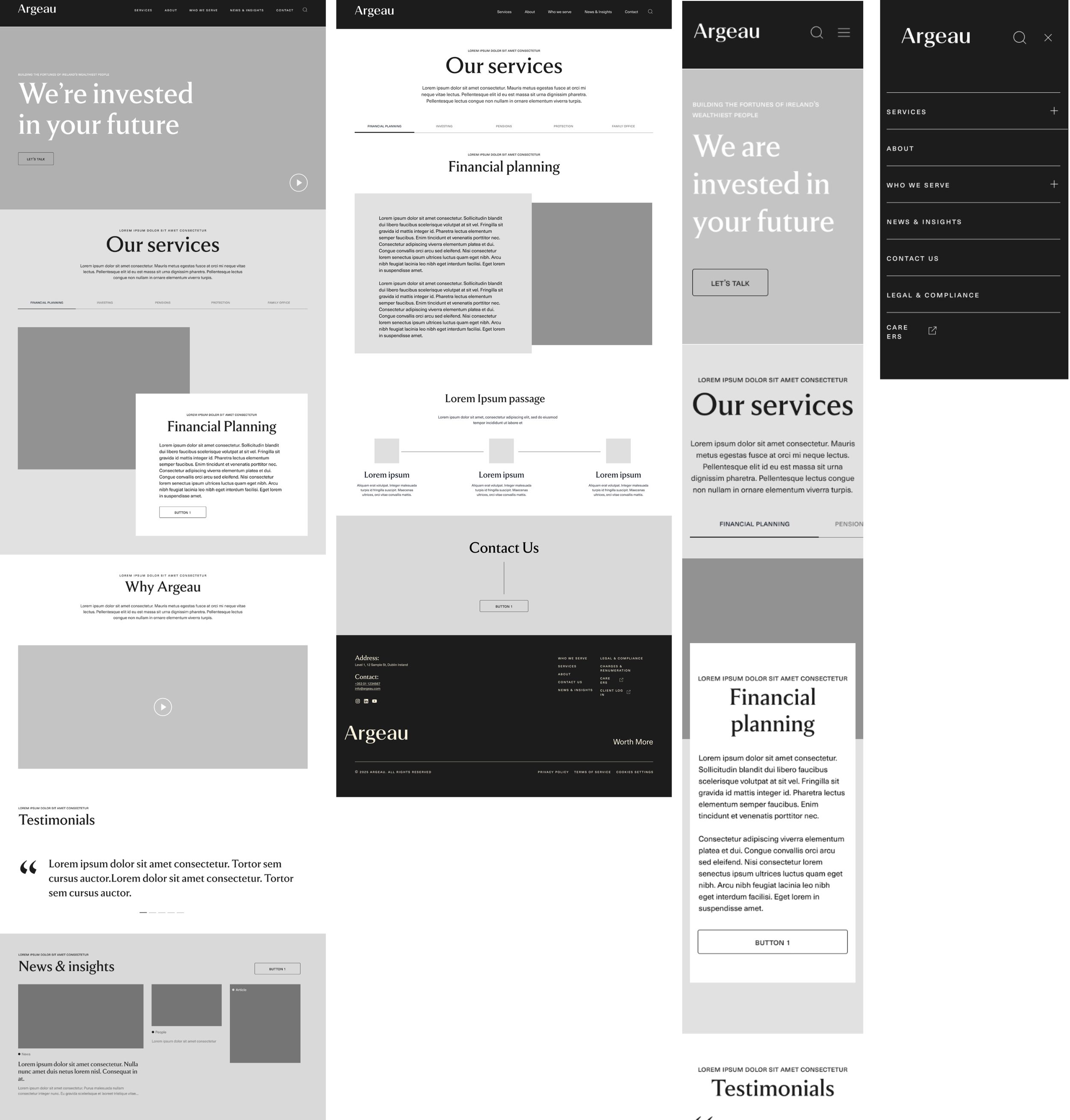
Visual Identity & Wirefaming
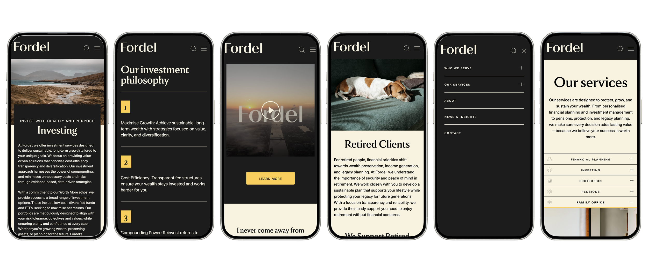
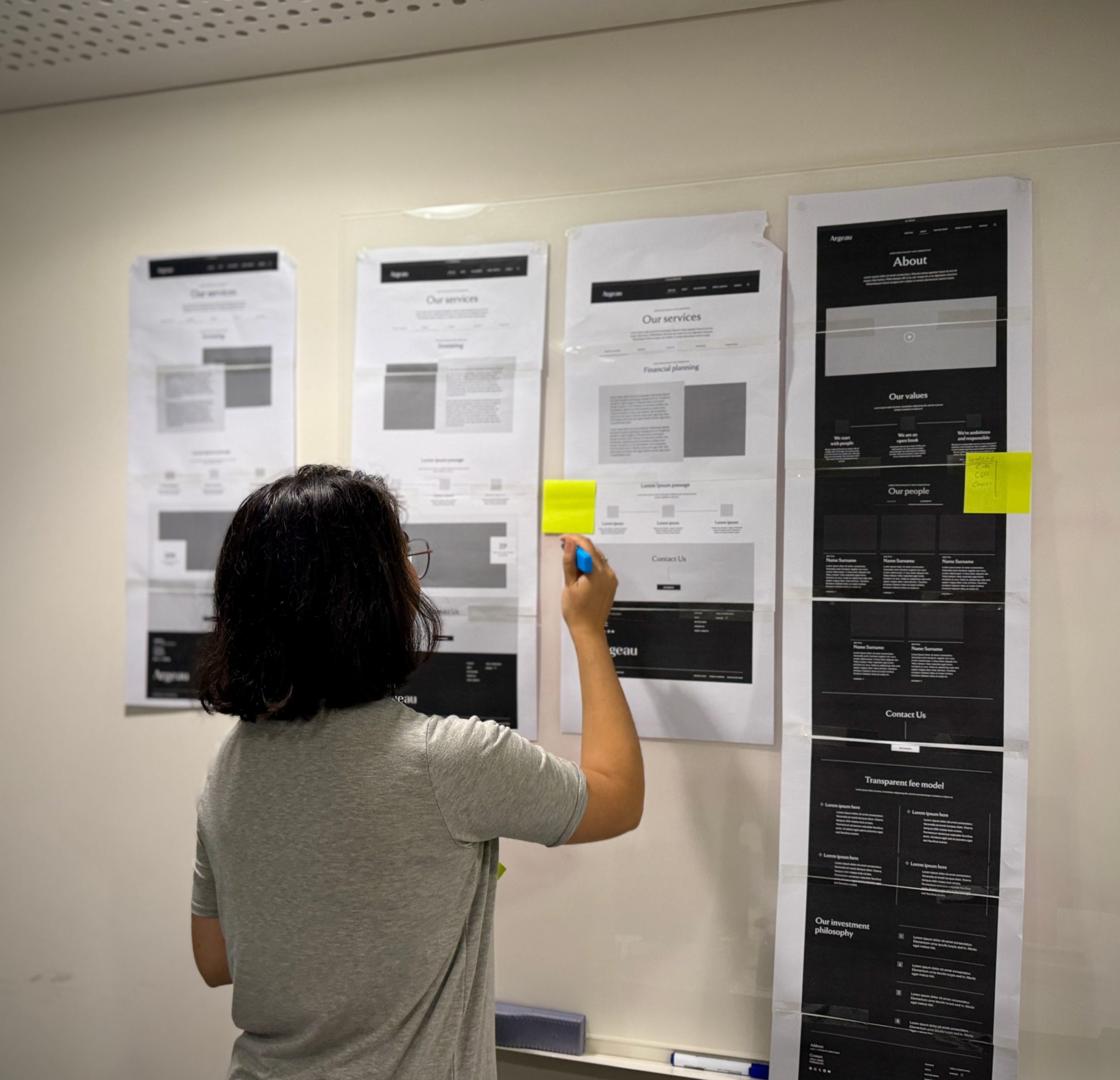
We developed comprehensive responsive wire frames for the entire site, progressing from low- to mid- and high-fidelity to iteratively refine structure, content hierarchy,
and interaction patterns. At the end of each phase, we facilitated client presentations using both digital and printed prototypes to gather structured feedback. Insights were systematically incorporated into subsequent iterations, ensuring alignment, usability,
and design quality at every stage.
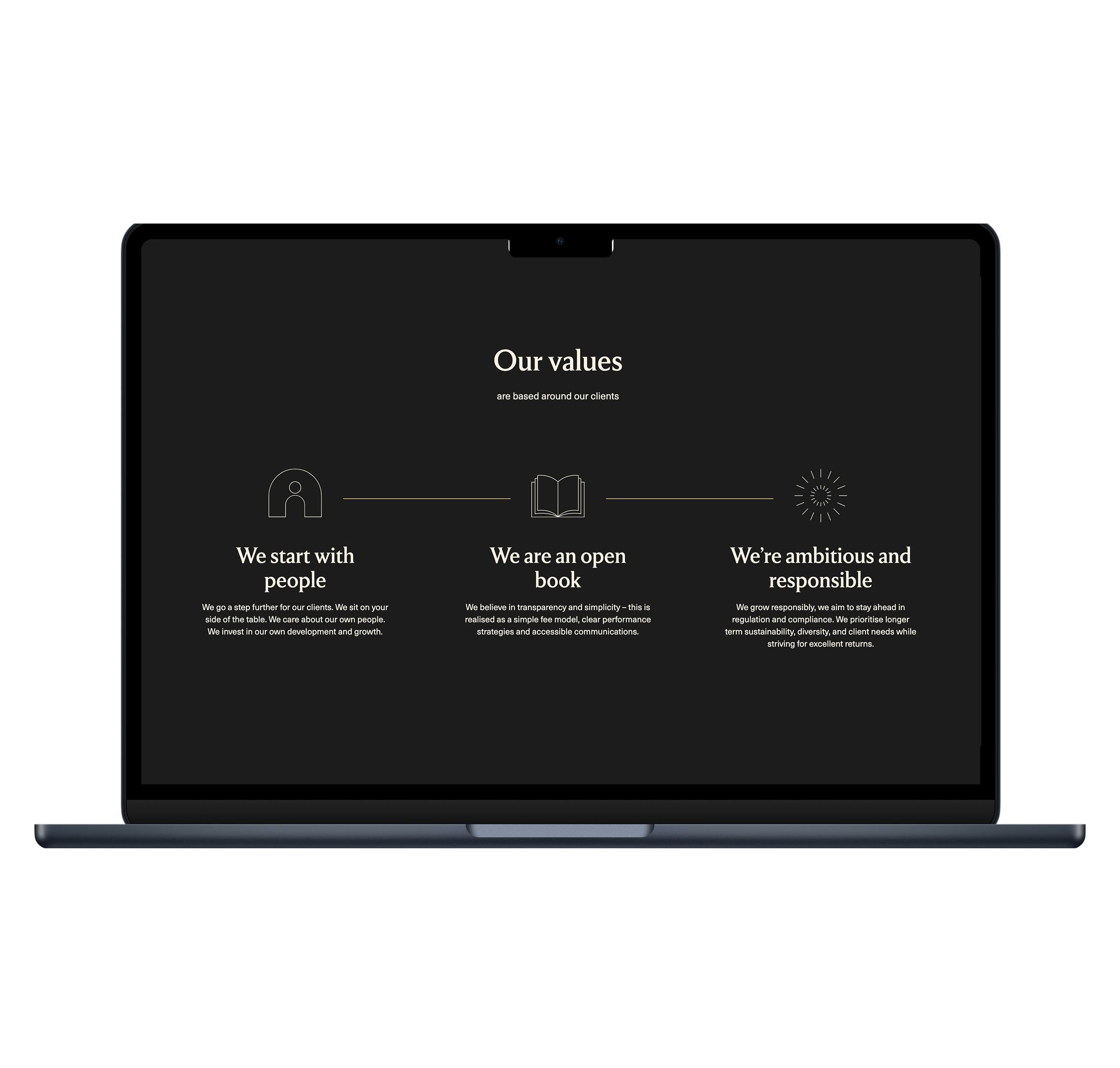
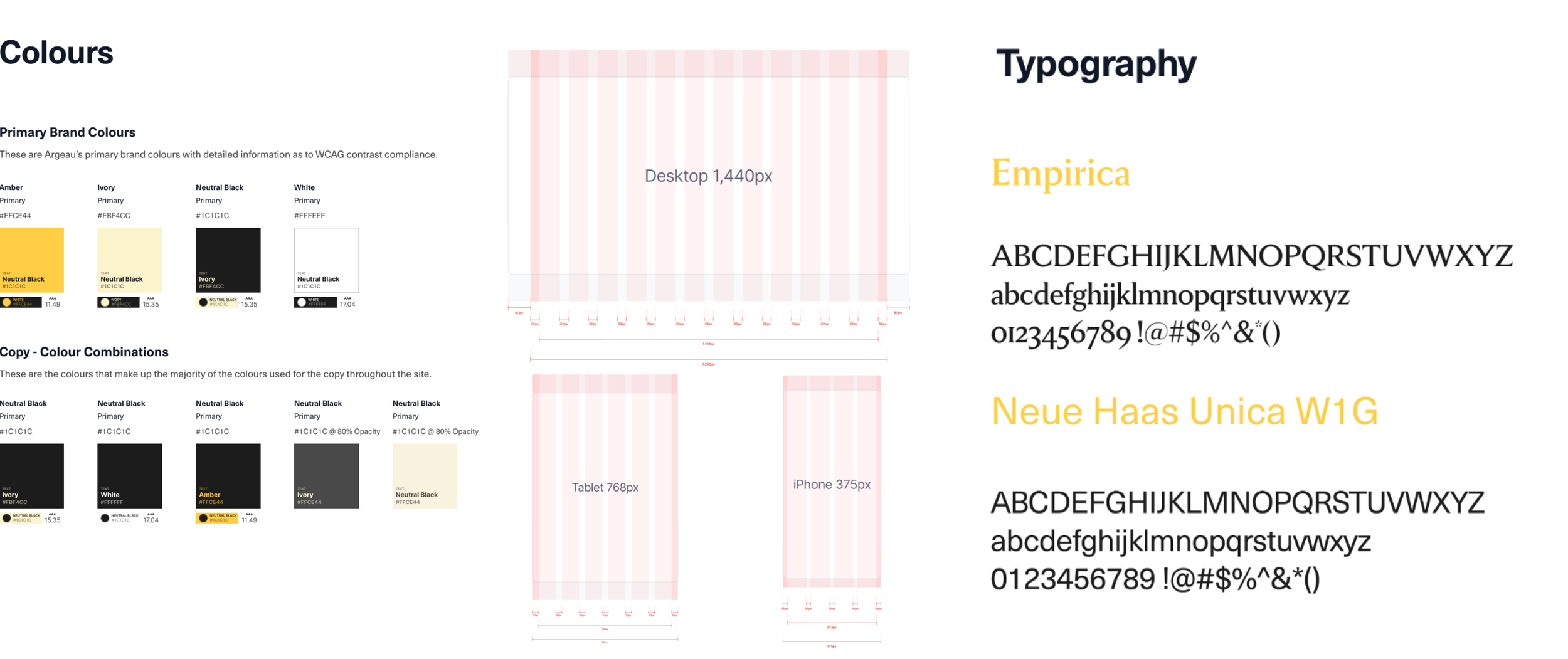
Building on the visual and verbal identity crafted by Zero G, we translated the brand toolkit into a scalable website design system. Colour, typography, layout principles, photography, and graphic styles were systemised to ensure consistency across pages and touchpoints, while tone of voice and key messaging informed content structure and UI patterns. We tested the palette against WCAG 2.2 standards, refined responsive type scales for desktop and mobile, and established a clear hierarchy to support multilingual content. We developed a modular component library—enabling efficient implementation, governance, and long-term visual
identity management.
The result
See it in action